I needed a graduation card for a couple of people this year. I ran across this card on Pinterest from Pattitudes Blog. I just loved the format she used and I wanted to use this as my inspiration.

Graduation Card

Graduation Card
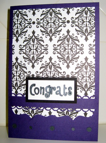
This is the card I came up with.
What I love most about this card, is the elegance that it carries!
This card format can be used for graduations and weddings.
I thought I would show you how I created the scalloped background for this card.
I wasn't able to find a design on the Silhouette shop that I was happy with.
So I sharpened my Silhouette Studio skills and made it work!
For the Tutorial:
I use multiple functions to create this background: duplicate, edit points, and weld.
I tried to show a screenshot to illustrate these functions along the way.
I wanted something with a couple of points on the bottom,
so I started with the 6-card_kit_elegant_C00394_20509 card design.
so I started with the 6-card_kit_elegant_C00394_20509 card design.
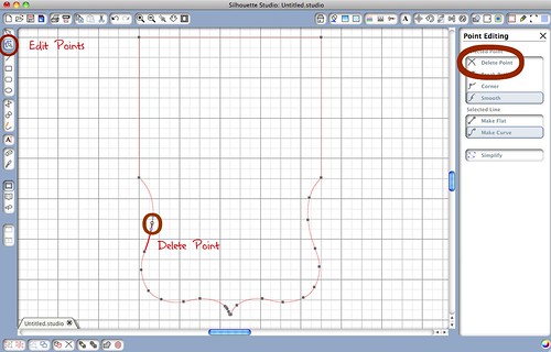
Edit Points
In order to have straight sides for the background image, I used the "Edit Points"
function on the top left to delete the unnecessary points.
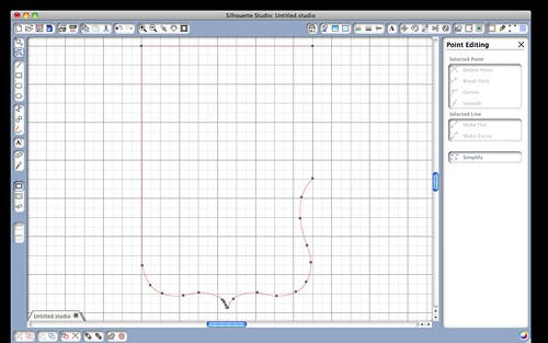
By deleting the points I was able to create a straight line down the side. Depending on the design selection you are using, you may have to use the "Make Flat" option under the "Selected Line" section to get the line to be straight instead of curve.
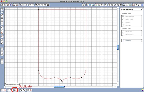
Once you are done editing the points, use the "Duplicate Function."
In order to have straight sides for the background image, I used the "Edit Points"
function on the top left to delete the unnecessary points.

By deleting the points I was able to create a straight line down the side. Depending on the design selection you are using, you may have to use the "Make Flat" option under the "Selected Line" section to get the line to be straight instead of curve.

Once you are done editing the points, use the "Duplicate Function."

Weld
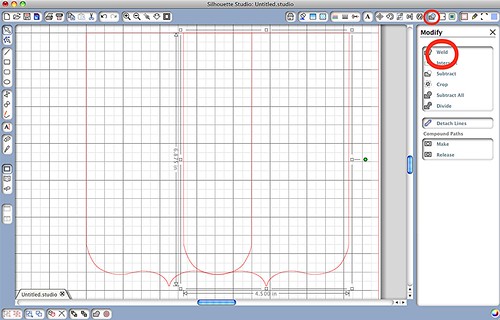
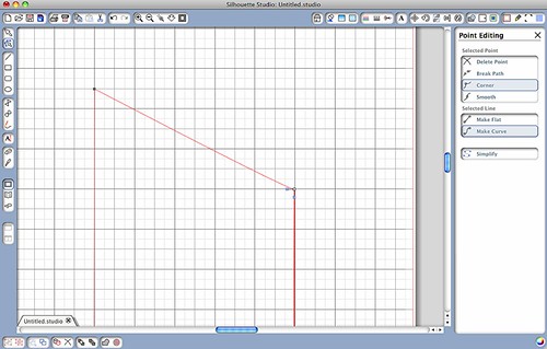
The welding function requires some sort of overlap in order to work.
I overlapped the two designs and used the top lines as my guide in making sure
they were in perfect alignment.
I overlapped the two designs and used the top lines as my guide in making sure
they were in perfect alignment.
It's always helpful to put part of your design directly on the grid lines so
that you know you have the two designs lined up perfectly.
You can zoom in and out too if you need to see it a
little closer when checking your alignment.
that you know you have the two designs lined up perfectly.
You can zoom in and out too if you need to see it a
little closer when checking your alignment.
I just took the top two corners and drug them to the height that I wanted.
And here is the finished scalloped background design.
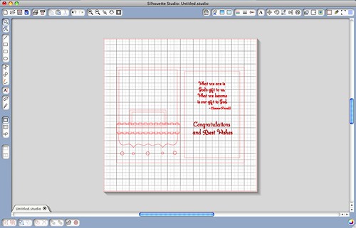
After you have the background made it's all downhill from here. I used the scallop_border_LG_1236 design to create the ribbon border. This border is only scalloped on one end so I used the weld function to create the double sided ribbon look. There are designs that already look like my finished product on the Silhouette shop but I'm cheap and wanted to use something I already had.
I used a couple of different qoutes for the inside of the card. I printed the inside quoutes from the Silhouette Studio and cut around it with the Silhouette using regestration marks. I'll get a tutorial up soon on how to use that.
I hope that this tutorial helps. Once you are able to use these functions with the Silhouette Cameo studio, the sky is the limit. I have been able to tweak just about any design to my liking and create some simple designs using these functions.





No comments:
Post a Comment